Most people who are aware of my work know I have original paintings and for sale… (See my newBuy Original Art! Store)
Many of these people realize that I have limited edition archival prints for sale…
But only a handful of people know I have imprinted merchandise for sale! So now I’d like to introduce my Buy Imprinted Merchandise! Store!
This online store features my selection of four companies that offer print-on-demand products for sale:
With each company’s websites listed below, I have descriptions of the specific products I’ve chosen to focus my designs upon. The links will take you directly to the Amy Ferrari Art page on their website.
The process of adding new images to new products is ongoing, and I’m open to putting most any of my images on any product, if the pixels allow.
If you can’t find the item you’d like imprinted with the image you’d like, please let me know, and I’ll do all I can to make the item/image combination available.
I’ve chosen Fine Art America as the main provider of my unsigned and unlimited edition art prints. Why?
•they have a good reputation and a high level of dedication to artists
•they have a good user interface
•they offer a wide variety of high quality prints
•they provide a Facebook Plug-in (prices are listed in Canadian Dollars!)
The comprehensive range of print possibilities allows for a size and framing option to fulfill every need!
•Art prints on Paper: a large selection of sizes, papers, framing, matting, and mounting possibilities
•Art prints on Canvas: a large selection of canvas sizes, canvas framing, canvas sheen, and wrap treatments
•Art prints on sheets of Metal or Acrylic: a large selection of sheet sizes, and a nifty stand-off mounting option •Art prints on Greeting Cards: customizable greeting cards available as singles, packs of 10, or packs of 25
For easy reference, all of the varying sizes of art prints I have available from Fine Art America are listed in a free PDF Catalog.
Framed Art Print
Canvas Print
Metal Art Print
Fine Art America also offers other select quality items:
If you can’t find the item you’d like imprinted with the image you’d like, please let me know, and I’ll do all I can to make the item/image combination available.
I’ve chosen Zazzle as the main provider of my general merchandise selections because Zazzle has a good reputation; most of the items allow for customer customization; and they have an irresistibly large range of print-on-demand merchandise. Though the Zazzle possibilities are vast, I’ve narrowed my Zazzle focus to the following items:
•Mugs Happy Art makes a Happy Heart… and a great start for the day!
•Throw Pillows
•Tote Bags
•Blankets so nifty to be able to wrap yourself in art!
•Fabrics a wide range of materials and customization options
•Journals
•Post-It Notes a cool collection of some of my doodle figures
•Calendars Customizable Flower painting calendar; customizable Tree painting calendar
•Onesies a very cute collection of Snarkle Tarts!
•Ties if you’re required to wear a tie, it may as well be unique!
Snarkle Tart Onesie
Tie
Throw Blanket from Zazzle
SenTrees of the Grapes Pillow – Zazzle
Flower Painting Calendar
Post-it Notes
TreeCentricity Calendar – Zazzle
Fabric
Daisy Spirit Sun Dance Mug from Zazzle
Fabric
If you can’t find the item you’d like imprinted with the image you’d like, please let me know, and I’ll do all I can to make the item/image combination available.
Art of Where
Art of Where is a Montreal-Based Canadian company specializing in creating unique apparel from custom printed fabrics. I’m so excited about this company because their high quality sublimation printing process allows for the art to be imprinted on the entire piece, not just sections of it. And the flexibility of their online design tool allows for many versions of a single item from just one image file. The variations are too much fun to come up with! So far, I have chosen to focus my designs on:
•Leggings and Capris Are you funky enough for these leggings?! Oh My!
•Scarves For when you need that extra pop of color!
•Skirts Are the skirts tamer than the leggings? Hard to say….!
•Beanie hats. So cute! These beanies come with a choice of linings.
Leggings
Capri Leggings
Scarf
Beanie Hat
Skirt
If you can’t find the item you’d like imprinted with the image you’d like, please let me know, and I’ll do all I can to make the item/image combination available.
Blurb is specifically dedicated to the on-demand publishing of books.
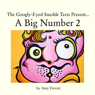
I wrote a book! Well, actually, I just wrote silly poems to accompany my Snarkle Tart images, and turned it into a photo book! Hopefully, you enjoy fart humour….
‘A Big Number 2‘ features my Snarkle Tart characters presenting different ways to talk about poo’s. The characters are captivatingly cute; and the poems that accompany each image will make you snicker!
So far, I only have one physical book version (softcover) available for printing on demand. ‘A Big Number 2‘ is also available in both iPad and PDF e-formats.
My Buy Original Art! Store is where you can peruse and purchase all of the available original paintings and drawings that I’ve created, as well prints (Artist-signed, limited-edition archival prints produced by Amy Ferrari Art).
Original art purchases can be made either by checking out my website’s Buy Original Art! Store, and then emailing the me directly, or by ordering items from the Amy Ferrari Art Store on Etsyby using the ‘Buy Now’ buttons.
Please consider art ownership, as these original works are in need of a forever home! “Happy Art makes a Happy Heart!”
Stay tuned…. Art Prints will be highlighted in my next post….!
On Saturday July 18th from noon to 8:00pm, check out the wares of local artists and artisans in the alleyway between the Uptown Parkade and Button Factory Arts (between King and Regina) as you’re checking out the Jazz Festival
My booth will feature a Once-Only Sale of my MUKster paintings at specially low prices. These irresistible characters want to come home with YOU!!!
Come on down! Join me on Saturday, May 9, as I attempt to engage the public to help me paint a 5ft x 5ft painting at Waterloo town square!
The City of Waterloo (with the help of Button Factory Arts) is working with me to produce an “Art Attack” style installation in Waterloo Public Square in celebration of National Youth Art Week. This event will be delivered in conjunction with eyeGO to the Arts’ event, Extra Curricular.
I’ll be inviting participating youths – along with everyone else – to help me express my view of Waterloo (#PictureYourWaterloo). It’s going to be a classic ‘paint-by-numbers’ scenario, and my painting will come together with the public’s and YOUR help. There are going to 100 individual 6in x 6in tiles that will need painting, so there’s plenty of opportunity contribute to this enormous work of art!
I’m still on such a high from the exhibition of Serene Yellow Spaces!
And I’m so grateful for everyone’s participation to make it such a success!
If you were unable to come to the show, or just missed some of the videos, they’re easy to find.
All of the morphing videos with the audio, are on You Tube!
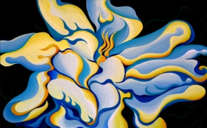
Welcome to the story of Serene Yellow Spaces, a collection of paintings I created with a challenging mandate.
This story chronicles my thought processes, from the initial proposal, to background motivations, all the way through the explorations of each painting created by my mandate.
The Initial Exhibition Proposal
This is an exhibit about restorative spaces that are both energizing and calming, resulting in an amazing positive atmosphere where good things can and will happen.
I believe art can have power; and the power of this art will motivate and inspire goodwill, creativity, and perhaps even healing. While most of the imagery will have been based on some aspect of reality, the overall effect will be largely abstracted, and thus more intuitively received by viewers.
Analog for Joy
The core elements will be sensuously joyful organic lines and shapes, unimpeded spaces, and generous amounts of energizing yellow. As a painter, I am a wrangler of visual elements, always trying to get them to behave and exist together harmoniously. My explorations will be geared towards plastic harmonies of biomorphic shapes and the emotional relationships and stories that are demonstrated by their spatial relationships.
I have a strong desire to create harmonious environments. Through many transformations, and many deliberations about how and why elements can influence their neighbors, eventually all elements come to a peaceful, unified conclusion: a gentle smile.
Additionally:
This will be an interactive show, incorporating Augmented Reality (which incorporates the use of mobile devices), hopefully along with other interactive technologies (still to be determined…) into the gallery experience. Interactive interfacing with gallery viewers can bring added interest and excitement to a show, by providing unexpected ways for viewers to gain greater insights into what goes into a work of art.
About My Painting Techniques
I am an image collector, and am always gathering images that somehow strike me in one way, or another, as intriguing or meaningful. Or perhaps somehow the image sparks my imagination. It will not be possible to bring all of my images to their full expression in my lifetime, but I intend to address as many as I can, letting my intuition guide my selections.
My painting technique is transformative. This means I always start with an image that serves as a starting point, whether it’s a photograph, or a scrap of paper with interesting markings, or a simple drawing. The selected image is transferred to canvas by differing methods, depending upon the desired level of complexity I wish to retain. I might use a grid method to paint the image directly onto the canvas from the source image if there is much detail to be exploited. I might trace the image using a canvas-size printout if the level of detail is less exacting. For this collection, since simplicity is the essence of this collection, I’ve been using the tracing method almost exclusively.
Once a version of the image appears on my canvas, with all colors painted in, it is finally time to begin to create my art. The painted image thus far is what I consider the ‘under-painting’. The transformations will be painted directly on top of the under-painting. Gradually, I’ll study the graphic elements (lines, shapes, color, etc.) before me, making slight changes at first; smoothing a line here, editing out a blob there, adjusting colors and values as I go. A key feature of the transformative technique is determining which elements must be preserved, and which must be changed, which must be eliminated or added in order to achieve the best result.
A Farewell to Diet Coke
All of these decisions are guided by the overall message that seems to want to be expressed by the image. Yes. The image and I are having a type of conversation. I’ll make a change; the image feels good. I’ll make another change; the image groans; and I revise until the groaning ceases. I’ll make a change; the image eggs me on. It can feel like the image is really in control, which I accept. I exist to serve the image so it can attain its peak expressiveness. Through all of this, I have a set of constraints that are bound by my personal style, which has evolved through 20+ years of painting. The image that comes to me, therefore, is accepting and expecting versions of these constraints. My style constraints usually include: definite organic, expressive lines; sensuous shaded shapes (I call these shape characters); and an un-ambivalent, bold use of color. The more attuned I am to the image, the more effective my painting.
My everlasting challenge as an artist is to always strive to become more attuned.
About Yellow
Some may wonder why I would want to feature generous amounts of yellow in every painting of this exhibition about serenity, as yellow can be seen as noisy, unsettling and frivolous. Yellow is my favorite color, as I’ve always been attracted by its energy, happy mood, and yellow’s powerful ability to concentrate intellect and spirit. It’s as if, to me, that yellow exists for the purpose of propelling us to greater levels of conscious progress and creativity. Also, yellow exists for the purpose of allowing our spirits to soar high enough to be able to jettison away the everyday petty things that can weigh our spirits down. With such tremendous power, yellow must be used judiciously, allowing all of the positive aspects to shine while limiting the potential overkill of its hyper puppy-like exuberance. Additionally, yellow must not be allowed to drift into the negative realms of dinginess and jaundice! Only healthy, strong yellows, and healthily yellowy neighbors of yellow (greens, oranges, and browns) shall be cast in the yellow characters of the paintings in this show. Placing some restraints on the over-exhaustive use of yellow will ultimately allow serenity to co-exist with the yellow, and result in an amazing sense of peace and harmony.
Blood Corn
Finding a Path to Serenity
What does serenity mean? For me, serenity is a condition of the soul, and it means ‘calm acceptance’. What does that look like? Well, representing calmness usually involves horizontality. Calmness can also be represented as a lack of excitement and an abundance of harmony, or, unity. A serene type of calmness epitomized by expansive scenes in nature, with sight lines that go into the distance: water, mountains, sky, trees and flowers. (There’s that horizon line again!) It’s as if the idea of serenity has to with something bigger than you. Big open spaces embody the serenity of the great outdoors. Indoors, most people find open, uncluttered spaces to be more calming than tight, cluttered spaces. Blues, cool tones and neutral colors all seem to point to serenity. A notable exception would be the type of serenity found a nice, warm, cozy cocoon setting, definitely not an open space, but also a space with no room for clutter or confusion.
Snowrenity
Venturing Into Space
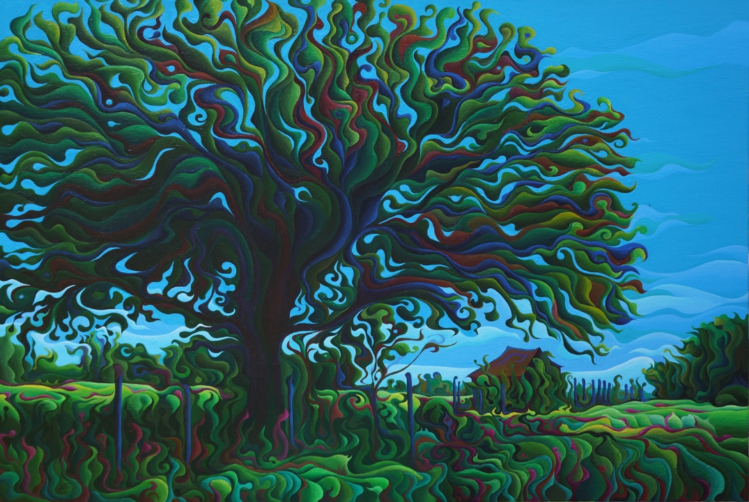
The reason to explore the more open spaces as opposed to complex and filled spaces; is to train myself away from complexity; not only for the sake of time and sanity, but also for the potential greater impact of composition. This series is a journey into greater purpose and greater self-control and greater spirit expression. Some paintings that I’ve done prior to this collection are detail-rich – sometimes to the point of exhaustive oppression as may be seen in ‘UmbrOaken Silence’, a recent tree painting.
UmBrOaken Stillness
I do not wish to give the impression that I am dissatisfied with this painting.
It communicates the contrast of the welcome and wonderful shade from a giant oak tree on a blazing hot day to the overwhelming heaviness from the thick humidity on a Southern sunny day. There is a shack on the right, beyond the tree, which does not seem to provide shelter nearly as well as the tree does. The tree acts as if it were an umbrella from the heat in the form of an Oak tree….UmbrOaken Silence!
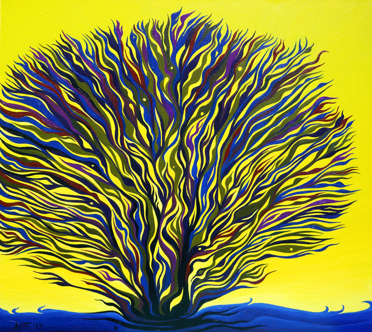
The Mandate
As I was contemplating ideas of simplicity, serenity, and yellow, I was engaged in the process of painting a small tree painting featuring yellow in the body of the tree – ‘Positronic Spirit Tree’. This tree had endless possibilities in terms of abstraction, as my starting image was a simple line drawing of a tree. The idea that came to me was spirals. Make it a tree of spirals. Yellow spirals. Green spirals. Yellow-Green spirals. Spirals to churn my mind as I do one repetitive detailed spiral after another. Extraneous details. Painful details. Enough of the details! There, now do I have it all out of my system?
Positronic Spirit Tree
This painting has a cheerful happy mood, bursting with life. There is a systemic positive energy – Positronic! – a cool word borrowed from Star Trek. Much busy work is to be done, but perhaps the focused activity leads to deeper thoughts.
This painting also served to help me realize and solidify my new mandate – to try to create a collection of paintings featuring an overall feeling of serenity, while showcasing my favorite color, yellow. Since this collection is meant to challenge my abilities, it has also been daunting and somewhat scary. I wasn’t sure how to go about this or how to approach each painting. The mantra that I have been using is: MORE RESTRAINT; SIMPLE; BREATHING SPACE; CELEBRATE YELLOW. I would like to take you along on my odyssey to greater, simpler, and Yellow-er art!
Now – the collection begins……………!
The First Painting: Going with what I Know
When you’re throwing yourself into a totally new place artistically, it can be rather comforting to go with what you know – and start with the basics. For me, the basics always come back to focusing on the line, a fundamental and founding element of my personal art history. So, my first painting was going to be heavily line-based, inspired by a winter photo I had taken of a shrub living in front of my favorite KFC/Taco Bell on Weber Street.
I’ve enjoyed many a taco in the presence of the shrub, and was always appreciative of its perfectly rounded structure. Also, this shrub, and its surrounding flowerbed, is always one of my favorite places to sit and notice the beauty of the passing seasons.
So I did a line drawing based on my photo of the bush, intending the resulting painting to be dark-shrub-on-yellow-background type of piece – almost a silhouette. The plant figure itself does have color, but the colors are dark, and relatively flat and un-modulated (not shaded or blended). As an experiment, instead of modulating the darkness in the lines of the shrub, I modulated the yellow in the background, going from a yellow-greenish sky toward a sunny yellow towards the base.
I love the radiating pattern suggested by the plant. This painting, ‘About to Sprout’, will always remind me of the time in early spring when the sun is shining stronger, but the plants still aren’t so sure about bringing their leaves out into the open just yet. While I was pleased with the simplistic happy statement made by this painting, the line-work, still, is on the overly detailed side, despite its relative flatness. So, the next painting must push me further….
About to Sprout
This mood of this painting is happy optimism – the future seems sunny.
The Second Painting: A Favorite Theme
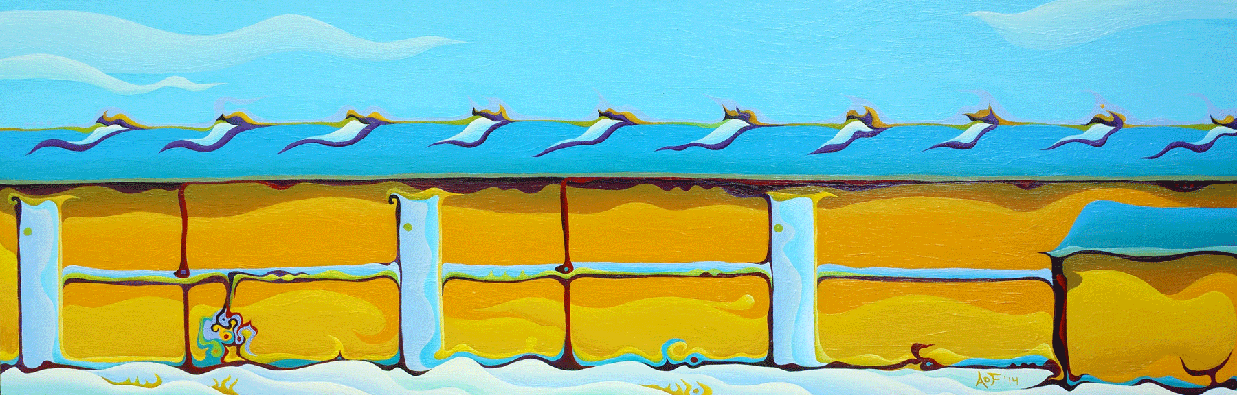
The next painting needed to be sure and have some open and undetailed spaces, so a photo I had taken outside of St. Jacobs of a red barn on Sawmill Road seemed like a good challenge. Though I have no sense of what actually is grown within this structure, my guess is that it might be a chicken house.
This long narrow red barn had been taunting me with its wonderful simplicity. One of my favorite things to do is to play with (transform) perpendicular shapes. As an organic line lover, I always feel it is my mission to soften or eliminate hard right angles whenever possible. The barn provided ample opportunities!
Letting go of the detail in the planks of wood allowed for many unfettered stretches of barn, which had become so soft, that the red was too overpowering, and, of course, yellow took the stage instead. This painting, ‘Grow House Groove On’ has a happy, simple rhythm, and had proven to be rather successful in the elimination of over-extraneousness. However, the gas meter (lower left side) was a detail I could not eliminate, as it seems to be in control of the whole scene – like a nucleus – and it helped balance the starkness.
Perhaps now I am on the right track, and perhaps I’m ready for something to further test my restraint….
Grow House Groove On
This painting presents a barrier, as if you’re held back from progressing into the blue yonder. But the pause is a welcome event, giving one time to collect oneself and grow and prepare for whatever is out there.
The indirect reference to pot within the title only speaks to the overall concept of ‘groovy’-ness.
The Third Painting: More Restraint Please!
Can I keep this idea of restraint afloat? The next painting is based on a photograph from the front of an old, rusty 1964 GMC pick-up truck. There certainly is something special about the flowing lines in these older trucks, and I wanted to capture some of this wonderful form.
So the structure lines of the truck became the armature of my painting, and it had to be preserved as much as possible. The rust was my chance for yellow to come out and play, and the un-rusted aqua paint gently slid to a background position, doing its best to allow ample space for the yellow to run and play.
I am well pleased with the way the rust play didn’t overtake the entire painting, ‘WooHooxadaisical Corrustination’, and the steadfastness of the lines of the truck! Now maybe I’m ready to venture into a more abstract realm….
WooHooxidaisical Corrustination
The mood of this painting has a quiet playfulness, like kittens playing around upon the dignified mother cat, silently observing and not intervening. The rust plays the part of the kittens; the vintage vehicle plays the part of the older, wiser cat.
‘WooHooxadaisical’ is a convoluted combination of ‘Woo Hoo’, a happy energy; and ‘lackadaisical’, a laid-back energy; which brings to mind a happy calmness. ‘Corrustination’ is another convoluted combo of ‘corrosion’; ‘rusted’; and ‘destination’.
It’s kind of oxymoronic, in that because of the corrosion and rust, the vehicle won’t really be reaching a destination.
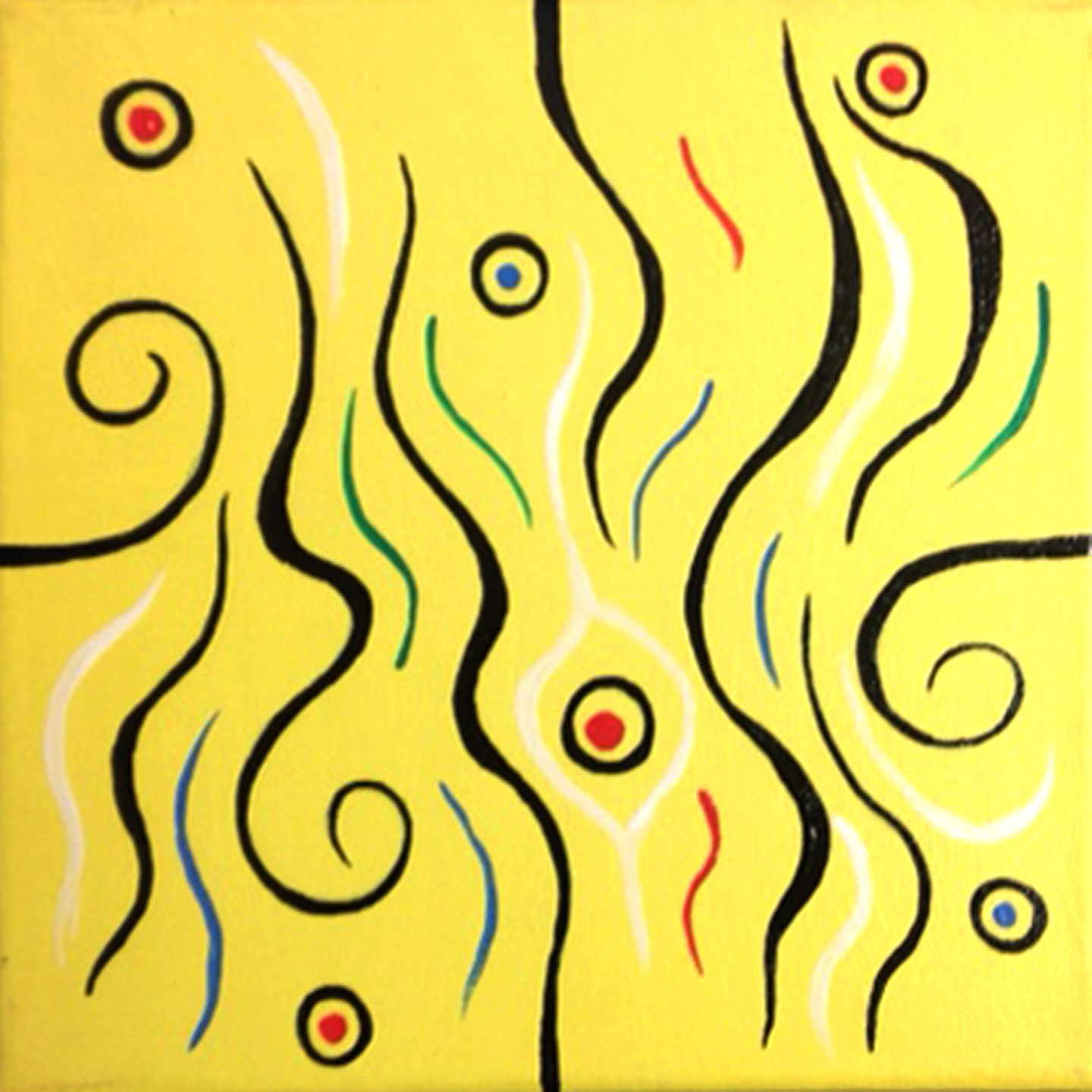
The Fourth Painting: Diet Coke Stranding
In the past, whenever I’ve attempted pure abstract paintings, I have always been gifted with these organic shape ‘characters’ that morph all over the canvas, doing as they please. While I still love the shape characters, I now am faced with restricting their reign, as I must give the wide-open spaces more importance and prevalence.
The lines and spaces providing the basis for this painting came from a snippet of paper doused repeatedly with Diet Coke. Yes, the lines are based on dried Diet Coke! So the way these lines relate to the background, almost wanting to dissolve back into the background, is what this painting seems to be about. Free flowing dimensional spirit spaces. Unlike ‘About to Sprout’, the modulation here is occurring more in the lines than in the background. While the lines are freely flowing, still they’re gently gliding near the surface of the background, like snow dancing across a country road.
Yellow Flow
This painting, ‘Yellow Flow’, has open spaces enough for the Yellow to breathe and expand with its happiness. Wow, that painting felt good…..
I think I’ll try another abstract…..
The mood of this painting is graceful celebratory movement. There seems to be a greater entity, say, the Sorcerer (upper right) transferring valuable knowledge and love to a smaller entity, say, the apprentice (lower left). A break-though or achievement has just occurred, and finally there is breathing room. Champagne?!?
The Fifth Painting: Another Abstract
As I’m painting this piece, the shape characters are doing their upmost to make their usual rowdy appearance. But I say if they do appear, they MUST behave! ….Well, they did appear, and it seems as if there’s a new sheriff in town, they did behave! As a result, the more compelling use of yellow was allowed to quietly emerge into supreme importance. Painting this much yellow on yellow is technically challenging and time consuming – due to the notoriously inherent transparency of yellow pigments, but so worth it for the warm fuzzy feeling. This painting, ‘Unbridled Innocence’ intentionally lacks my usual high level of contrasting value and color for the sake of greater visual harmony. The lack of contrast points toward a softer feeling of freedom, total innocence, and an absence of foreboding. There is plenty of open space for the shape characters to play and explore safely.
Unbridled Innocence
This painting is based on a scrap of paper filled with random paint marks.
The mood of this painting is glorious, like waking up to an amazingly perfect sunny day with nothing to do but explore whatever drives your bliss. As I reflect on the painting, I’m sensing a deep connection to my childhood. It’s possible that my childhood self may be characterized in this painting by one or both of the shape characters in the lower right-hand corner.
The Sixth Painting: A New Confidence!
In this painting, I’m again playing with perpendicular shapes, however in this piece, the spaces are even larger than in ‘Grow House Groove-On’. The imagery is based on a battery of industrial sized power boxes located in a large factory warehouse setting. ‘Double Door Power Play’ is perhaps the closest I’ve come to achieving an equal balance of abstract and representational imagery in a single painting.
The wire cables are activated linear elements, quivering with electricity, leading the way for each box to be connected with the others. The power box doors’ yellow glow is suggestive of the massive energy behind them. The shadows also play a role, becoming both shape characters as well as dark patches of obscured light. The unbroken spaces startled me at first, but I’m beginning to become more comfortable and calmed by them – an important step on my path toward more open spaces.
Double Door Power Play
The mood of this painting is warm, and somehow reassuring. There’s tremendous power, but it’s all connected and is only going to be used for the force of good. The orange in the painting is all about power and warmth, but the orange shape characters are safely restrained in their rectangular power cells.
The Seventh Painting: This Is What I’m Talkin’ About!
This painting, ‘Next to Godliness’, was perhaps the most challenging, thus the most rewarding painting so far. The starting image is of a local Mennonite Church, apparently on a cleaning day. More than most of my work, this painting has much intentional symbolism integrated into the imagery. I couldn’t help it – there were so many opportunities! The challenge here was incorporating the synergy of spirit while adhering to my mandate. Part of me wanted to ignore the mandate, and get carried away with my ideas of spiritual symbolism.
However, the mandate helped guide my decisions. The sky, part of the roof, and body of the building are all relatively unbroken, and there is a great sense of horizontality in the building, grass, and line of trees. Also, there’s a good amount of restfulness in the blues and greens that make up the greater part of the picture-plane. The tree bough shapes are puffed up with expansiveness, and joyfully bounding towards heaven, as if they’re in a Bouncy Castle. And there’s a certain amount of serenity in the figures sitting outside of the building, their work is done, for the moment, and they’re taking a well-deserved rest. Interestingly, the female Mennonite figures’ dress also resemble iconic female dress from Middle Eastern and Indian traditions.
The yellow takes center stage, and becomes key to some of the meanings in the piece: glory, sunshine, joyful happiness, new growth, and brilliance.
The trees, originally behind the building, have overtaken the roof, allowing the spirit within the church to commune with heavenly and Universal spirits. The greenish-gold is a reference to the life-giving energy of the sun through the process of photosynthesis, serving to calm our hearts, nourish our bodies, and clean our air. The blue inside the building, seen through the windows is the Holy Spirit, which is mostly interested in connecting with the trio sitting outside, and there’s a faint spirit figure in the right doorway, whose affiliation may or may not be with the dark side….
Next to Godliness
The Eighth Painting: Re-Visiting Mechano
This painting, ‘Tawny Transference of Mojo’, was an insanely time-consuming distillation of elements. The decision to use the selected image of Mechano was perhaps ill conceived. I guess I was asking for it. The reference image was everything but serene: the vertical format, the complex level of detail, the industrial atmosphere – What was I thinking?! The imagery evolved so much, that there is very little resemblance of the final piece to its beginning source. I suppose it may have helped if I had been determined to keep the structure, like I had been with the GMC. But I had been looking forward to tackling a piece with no constraints. So, simplifications raged, and the shape characters were soon in control, being vocal as hell. On and on they went, having their way with me, and all the while I was feeling like I had failed my mandate totally – back to where I was before I started this collection….. Or was I?…
Tawny Transference of Mojo
Well, I did go out of my way to have horizontal elements out-number the vertical elements. The system of inter-twining pipes and tubes is self-contained, thus allowing a feeling of snuggly cozy warmth and comfort. And the colors are warm and soft, lacking harsh color contrasts. And the shapes are large curvy comforters. So, hmmm, perhaps this is that cozy, snuggly type of serenity, replete with lots of gentle curves to nuzzle, and interesting nooks to retreat into for a nap. As I compare the final piece to the reference photo, I realize that after I get over the vast differences, I can sense that the final work is perhaps an x-ray-like psychic peek into the schematics of the enclosed system of mojo movement – yeah!
The Ninth and Last Painting: A Culmination
In addition to honoring the mandate, for this painting, I hoped to incorporate some of the ideas that transpired in the previous eight paintings. Again, this painting is based on a scrap of paper filled with paint marks.
Pro-Photonic Sunshine System
The general composition reminds me of the composition in ‘Yellow Flow’. The shape characters were not a feature in ‘Yellow Flow’, however. Many of the shape characters are more delicate and smaller than usual shape characters tend to be, similar to those in ‘Unbridled Innocence’. The colors relate fairly strongly to those in ‘WooHooxidaisical Corrustionation’ and ‘Grow House Groove-On’; with the yellows stealing the show, and the blues providing a calming backdrop. There seems to be an aspect of interconnectivity, as seen in ‘Double Door Power Play’ and ‘Tawny Transference of Mojo’. The use of collar like elements used in ‘Tawny Transference of Mojo’ reappears in this piece. I am striving to create and retain large open spaces, and to have all the elements have a flow of elegance, like in ‘Yellow Flow’ and ‘Unbridled Innocence’.
The painting is entitled “Prophotonic Sunshine System”. In the end, the painting seems to be about the hopeful idea of having a system in the atmosphere that is able, at a molecular level, to cut through the haze and ozone damaging pollution to bring greater clarity and light to earth. Like ‘Unbridled Innocence’, the level of contrast in this piece is low. But instead of the shape characters being enchanted by the possibilities, these shape characters are dutifully engaged with their very important mission.
For me, serenity is a condition of the soul, and it means ‘calm acceptance’.
What does that look like?
Well, representing calmness usually involves horizontality. Calmness can also be represented as a lack of excitement and an abundance of harmony, or, unity. A serene type of calmness epitomized by expansive scenes in nature, with sight lines that go into the distance: water, mountains, sky, trees and flowers.
It’s as if the idea of serenity has to with something bigger than you. Big open spaces embody the serenity of the great outdoors. Indoors, most people find open, uncluttered spaces to be more calming than tight, cluttered spaces. Blues, cool tones and neutral colors all seem to point to serenity. A notable exception would be the type of serenity found a nice, warm, cozy cocoon setting, definitely not an open space, but also a space with no room for clutter or confusion.
The challenge with serenity is to not over-do it. Serenity is just a short step away from boredom. And that’s where the yellow comes in!
I hope you can make it to my show, Serene Yellow Spaces, on Friday, March 13th, from 5:00 to 7:00 at Button Factory Arts.
Why I would want to feature generous amounts of yellow in every painting of this exhibition about serenity? Well, yellow is my favorite color, as I’ve always been attracted by its energy, happy mood, and yellow’s powerful ability to concentrate intellect and spirit. It’s as if, to me, that yellow exists for the purpose of propelling us to greater levels of conscious progress and creativity. Also, yellow exists for the purpose of allowing our spirits to soar high enough to be able to jettison away the everyday petty things that can weigh our spirits down. With such tremendous power, yellow must be used judiciously, allowing all of the positive aspects to shine while limiting the potential overkill of its hyper puppy-like exuberance. Additionally, yellow must not be allowed to drift into the negative realms of dinginess and jaundice! Only healthy, strong yellows, and healthily yellowy neighbors of yellow (greens, oranges, and browns) shall be cast in the yellow characters of the paintings in this show. Placing some restraints on the over-exhaustive use of yellow will ultimately allow serenity to co-exist with the yellow, and result in an amazing sense of peace and harmony.
You can see my work in person!
While seeing the photographs of paintings is quite helpful, there’s nothing like being able to see a painting in person! The listings below are all places in the Region of Waterloo where you can go to view actual paintings. Also, I’m always happy to meet you at any of these places, just send me an email and we can schedule a time to meet.
Chrysalides House of Art
School of Fine Art and Gallery www.CHRYSALIDESHOUSE.ca
619 Wild Ginger Avenue, unit A2, Waterloo Phone: 519 208-5961
Chrysalides House usually has one or two of my paintings in the Gallery. This location features a gallery, gift shop, an art studio, printmaking studio and creative play lounge, where they offer ongoing weekly fine art classes for both children and adults.
Office of Lou Seguin, Tax Accountant
72 St. Leger Street, Unit 300, Kitchener
This is the space where I previously shared a studio space with Lou Seguin, my good friend and tax accountant. Happily, Lou is keeping some of my available art on his walls, so the paintings don’t have to sit in storage, and you can visit them any time! And Lou is a great tax guy if you need one! (Contact him directly – louseguin@bellnet.ca ) While Lou usually welcomes visitors, (Well, maybe not so much during tax season unless you’re a client!) it is best to contact me so I can set up a time to meet you there.
Button Factory Arts Gift Shop Button Factory Arts
25 Regina Street South, Waterloo, ON, N2J 1R8
I usually have some smaller pieces and prints hanging around at the gift shop. There are soooo many cool items there all year-round. Christmas season is extra special, as the gift shop overtakes the gallery space in December!
A recent addition to the gift shop is this amazing cabinet! Scott Crockard has created and is selling custom furniture featuring panels of my work! So cool!
Amy Ferrari Art Studio Button Factory Arts
25 Regina Street South, Waterloo, ON, N2J 1R8
This is my little home away from home. My studio hours tend to be spotty, so to be sure to catch me at the studio, please contact me!
Amy Ferrari has moved her studio to Waterloo’s Button Factory Arts, where she also teaches various classes, including an intensive Colour Lab. The tiny 2nd floor office space is well lit, with lots of natural light, and it’s gradually becoming a very warm and cozy creating space. Despite her unpredictable working hours, Amy welcomes studio visits, and usually has an open-door policy, with a ready smile.
“The decision to leave Globe Studios and leaving a shared space with the amazingly talented Lauren Judge was a very difficult decision. However, the Button Factory has always felt like home, and I’m already there alot for teaching, and it’s much closer to home!”
In addition to teaching and painting, Amy also has small paintings and prints displayed and for sale in the Button Factory’s Gift Shop.


You must be logged in to post a comment.